Angular Quickie - Component ViewEncapsulation and WebComponents
“Component” is perhaps the most overloaded term when it comes to JavaScript frameworks these days. Every single framework has its definition of what precisely a component is, also Angular.
Components are the building blocks of Angular apps. By default, Angular embeds components into the DOM. When Angular renders your component, the entire contents of your template (string or loaded from the given URL) goes inbetween the component’s selector.
There are two different ways how Angular is injecting the view for a given component. ViewEncapsulation is responsible for defining how Views are injected. If you create a component like this:
import { Component, Input } from '@angular/core';

@Component({
  selector: 'todo-item'
  templateUrl: 'todoitem.html'
})
export class TodoItemComponent {

  @Input() caption: string;

}
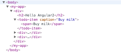
Angular uses ViewEncapsulation.None. Which results in the following DOM.

As soon as you change your component definition and provide either inline styles using the styles property or reference a Stylesheet file using the styleUrls property, Angular will use ViewEncapsulation.Emulated which will result in the following DOM. Let’s review the updated @Component definition first:
@Component({
  selector: 'todo-item',
  templateUrl: 'todoitem.html',
  styleUrls: ['todoitem.css']
})
Here the pure CSS which we provide at styles/todoitem.css
.todo-item-caption{
  color:purple;
}
Those changes result in the following HTML

Notice the _ngcontent-uxg-2 attribute is added automatically to the template’s root node and _nghost-uxg-2 added to the selector? Why does Angular add such an attribute? Open the inspector and double check the styles you’ve provided.
Angular is adding those classes to enforce CSS styles only for the given component. It is emulating the Shadow DOM. So your CSS looks similar to the following once rendered:
.todo-item-caption[_ngcontent-uxg-2]{
  color:purple;
}
This works fine in most situations. However, there are situations where you need more control over your template. Let’s extend our example from above. Let’s say we’re referencing another stylesheet on an application-wide level with the following content.
span {
 color: blue !important;
}
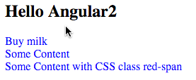
So every span will be rendered in blue. also our todo-item-caption our custom stylesheet which is trying to set the color to purple will be overruled by the .span class because of the !important operator.

WebComponents to the rescue🔗
Angular ships with a third mode for ViewEncapsulation, the Native mode. Native means nothing more than using standard WebComponents instead of emulating or just injecting the HTML. The native encapsulation mode is easy to activate. Just alter your component definition to match the following
@Component({
  selector: 'todo-item',
  templateUrl: 'todoitem.html',
  styleUrls: ['todoitem.css']
  encapsulation: ViewEncapsulation.Native
})
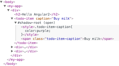
Reload the app and verify the DOM. Now you will see that Angular is using a WebComponent to display the todo-item directive.

Using WebComponents you can ensure that your component is rendered as you want and not changed by stylesheets defined on an application-wide level.
Here is the entire app published as plunkr, you will find the buy milk caption in purple. Feel free to play around.